Blog
Integrating Gaming and e-Learning Design Part I of 3: An ID-Based Model
Part 2 of 3: Bright Horizons Thanks for coming back. If you didn’t read Part 1 of this article, you should. Your life will be better, skin blemishes ...


Integrating Gaming and e-Learning Design
By Edmond Manning and Ellen Burns-Johnson | December 05, 2017 | Custom Learning | 0 Comments
Part 2 of 3: Bright Horizons
Thanks for coming back. If you didn’t read Part 1 of this article, you should. Your life will be better, skin blemishes will vanish, relationships will improve, and this blog post will make a lot more sense.
Bright Horizons
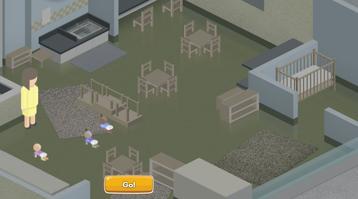
We will now explore how one of our award-winning projects, Bright Horizons. (C’mon, how could we not do a sideways brag here?) This project was a game-based e-learning experience—imagined using our model. As an organization, Bright Horizons had an important goal for toddler day care: keep the children safe and well-cared for. Don’t let them roll off tables onto the floor, don’t let them crawl out of the room, don’t let them put unusual objects in their mouth, the kinds of activities this particular age group finds delightful. It might be useful for you to play the game yourself before reading this blog—that may provide a rich context for you for the rest of this blog post.
Or not.
You’re an adult, so we’re not going to tell you what to do. But please, do not put unusual objects in your mouth.
You’re back! Fantastic. Let’s take a look at how this project fits the model we proposed.
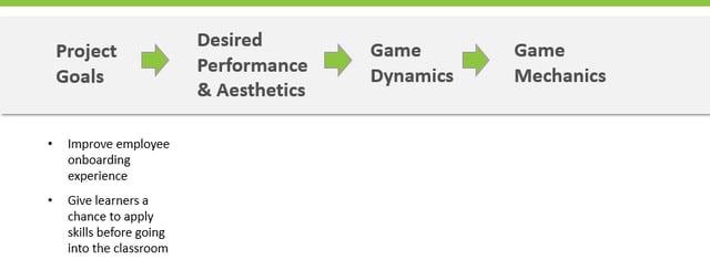
Project Goals
The goals were, well, check out the graphic below.
Desired Performance
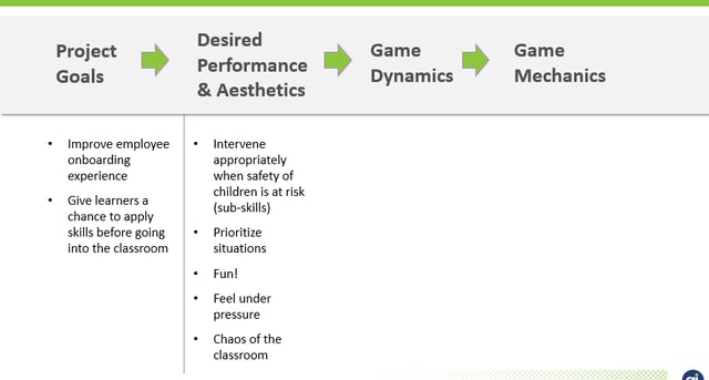
We worked with the stakeholders to define the desired performance that would improve the onboarding experience and give new employees the chance to apply skills. Obviously, there are a number of detailed skills. But clusters of skills (before being broken down further in a skills hierarchy), looked like this:
So far so good? Yes? Great.
Aesthetics
Now comes a more challenging part as one thinks through the aesthetic experience. The immediate word that leaps to mind is “fun.” Sure. Of course. People want a gaming experience to be fun.
Why?
Because fun experiences tend to be repeated voluntarily. Because people are more likely to learn if they’re engaged in an experience that delights them. There are plenty of reasons to enjoy that word. However, don’t stop there.
Adult learners want to know that the training experience correlates to the real world and prepares them for real challenges ahead. So, when it comes to aesthetics, consider matching the feelings of the online experience to the real world. That will help learners believe in the relevancy of your e-learning experience.
With Bright Horizons, we discovered the aesthetic experience associated with crawling, grasping toddlers who like putting things in their mouths were “stress” and “chaos.” We wanted learners to feel that pressure, to better prepare them. Therefore, our completion of the second column looked like this:
Dynamics
Considering game dynamics can be challenging only because we’re used to discussing mechanics and linking that immediately to aesthetics. For example, consider this sentence: “Learners will have fun drawing advice cards!” That’s a faulty conclusion. Assuming people will “have fun” reflects the speaker’s emotional excitement for having an intriguing idea. Do not confuse “having a pleasing internal reaction” with an aesthetic.
Dynamics are essential because the experience of game mechanics allows us to see if we will match the desired aesthetic.
It sounds strange, but is it?
Consider food.
When designing a dinner, do you serve turkey, lasagna, roasted pig, and spaghetti at the same meal? No, of course not. And you don’t make that decision at the grocery store—you plan the meal first, then, select food. You ask questions like, how heavy is each course? How long will the dinner take to eat? To prepare? In this loose metaphor, you plan for the experience (dynamics), and then choose the food (mechanics).
Regarding Bright Horizons, we wanted learners to feel chaos and stress, yes. But not to the point of quitting the game in tears. After all, we want to coach them into readiness, not terrify them regarding their new employment. Stress and chaos can be powerful teachers, as long as you’re not overwhelmed.
A sample of our analysis looked like this:
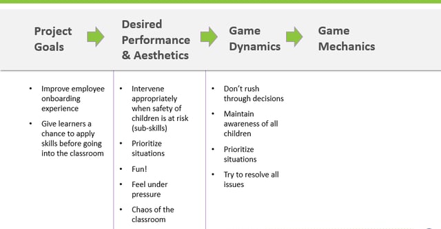
Consider the dynamic of “making critical decisions.” We decided we didn’t want them to rush through decision-making. That would create too much stress. Whatever game mechanics we employed had to have options for “slowing down” the experience enough to give learners time for reflection.
Discussing dynamics is useful before mechanics because, well, discussing mechanics is more fun. Timers! Surprises! Dice-rolling! That’s the fun part of gamification. But before you can decide on mechanics, you really need to get clear on what experiences you want learners to have so that you can select the right mechanics.
Mechanics
Once you know the aesthetics you’re going for, and what kind of experiences are necessary to build those aesthetics, game mechanics are soooooooooooo much easier to select. You’re no longer guessing at what it takes to build the game. You have a blueprint.
And, what’s even better than something being easier? How about confidence? Having a blueprint gives you confidence that the game mechanics you employ have a much better shot at achieving project goals than randomly gamifying an experience.
Think about Bright Horizons. It seems “a timer” makes a good candidate as a game mechanic, because timers can increase stress and help someone feel the “weight” of time-based decisions. (Catch that kid before he puts a crayon in his mouth!) And yet…we had to balance that mechanic with “how much stress” is going to be felt in aesthetics. When looking at the dynamics of what we actually NEED, we concluded, well, take a look:
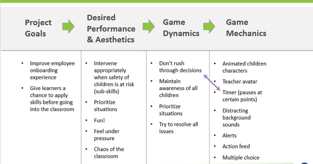
Boom.
A timer? Yes. But with the ability to pause. Give the adult learner some control over the experience, and a moment to “breathe” during a difficult decision. These game mechanics were dictated by the dynamics, which contribute to the aesthetics, which we believed are necessary to practice the performance to achieve the project goal.
Whew. That as a mouthful.
What this table is, is a plan. That’s what we do as instructional designers: figure out what to build based on where we want to end up.
Next up, in Part 3 of this series, we’ll analyze some ways you, the at-home-viewer, can prepare yourself to fill in this chart. We’ll suggest questions to ask stakeholders, and explore ways to consider more about game mechanics, dynamics, and aesthetics.
See you next time, Player One!
About the Author: Edmond Manning and Ellen Burns-Johnson
Comments
Would you like to leave a comment?
Related Blog Posts

By: Edmond Manning and Ellen Burns-Johnson | Nov, 2017
Category: Custom Learning, Strategic Consulting

Blog
Q&A: Migrating ILT to Digital Delivery
Part 2 of 3: Bright Horizons Thanks for coming back. If you didn’t read Part 1 of this article, you should. Your life will be better, skin blemishes ...
By: Edmond Manning and Ellen Burns-Johnson | Mar, 2020
Category: Custom Learning, Allen Interactions Team

Blog
What If We Reviewed e-Learning Courses Like We Reviewed Movies?
Part 2 of 3: Bright Horizons Thanks for coming back. If you didn’t read Part 1 of this article, you should. Your life will be better, skin blemishes ...
By: Edmond Manning and Ellen Burns-Johnson | Jun, 2015
Category: Custom Learning

