
Blog
Responsive e-Learning and Milton Berle’s Glasses
By Carrie Zens, Director of Marketing / @carriezens Ah, the world of ever-evolving technology. It’s wonderful and completely irritating at the same ...


By Carrie Zens, Director of Marketing / @carriezens

Ah, the world of ever-evolving technology. It’s wonderful and completely irritating at the same time. We continually push the envelope, making everything faster, smarter, better. Smartphones have larger screens and more bells and whistles. We've coined the term 'phablet' which I didn't think was a real word until I looked it up on Wikipedia. And please, continue to make battery life a priority for me and many others who struggle to stay connected!
It's a daily occurrence for a majority of us to bounce between multiple devices and applications for varying personal and professional purposes. We are consuming gobs of information daily and when we seek information online, we want it fast, and we demand an engaging and intuitive experience. We live in a world of typing and mouse clicking from our desktop computers or laptops one minute and then scrolling and tapping on our mobile devices to read emails, texts, and do social sharing and consuming on Facebook, Twitter, and other social sites that even I, as a marketer, can’t keep up with (SnapChat - no thank you).
Two Web Design Approaches
1. Responsive Web Design
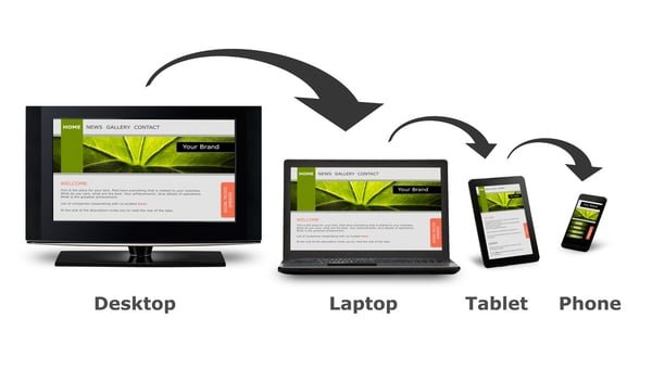
Being a marketer, I am well aware of responsive web design (RWD) and when it really made waves in the web design and development industry, a field constantly challenged by the need to create websites that fit all varying mobile devices and screen resolutions. In 2013, Allen Interactions launched, what I thought was, a beautifully innovative and fresh looking new website. Shortly thereafter, RWD took over and practically overnight anything that wasn’t “responsive” was considered a dinosaur, including our website.
As defined on Wikipedia and first coined by Ethan Marcotte in a May 2010 article, “RWD is an approach to web design aimed at crafting sites to provide an optimal viewing and interaction experience—easy reading and navigation with a minimum of resizing, panning, and scrolling—across a wide range of devices (from desktop computer monitors to mobile phones).” So, my definition of RWD is that it's a web development approach where you author or build one design that fits multiple mobile device screen sizes and resolutions. A way to test out whether a website is responsive or not is to adjust the size of your browser window on your desktop or laptop. If it is responsive, the content and layout will be flexible and change to the size of the window.
2. Adaptive Web Design
Just to confuse you more, adaptive web design, AWD, is another web development approach. The delivery is the same as RWD in that the authored content responds or changes to the screen sizes of various devices, but the development or delivery of AWD is different. With RWD, one design is created with dynamic structures that resize and align automatically based on browser size. With AWD, many design layouts are created specifically for the mobile devices the solution will be delivered to or accessed on.
Responsive Design, Mobile Usage & Learning
So where am I going with all of this? Recently, I’ve run across various articles on responsive e-learning design, what it means for the training/learning industry, how technology and the training industries are adjusting to accommodate the needs and opportunities mobile devices have introduced, and how organizations are harnessing responsive design for their learning efforts. In our personal and professional lives, we cannot ignore the continuing surge in mobile device usage and the fact, according to the graph below, just over half of Internet traffic is now coming from mobile devices. It’s here to stay, and in many cases, responsive e-learning can be the ticket to a meaningful experience for your learners.

Responsive Design: Marketing vs. Learning
The worlds of marketers and learning designers/developers are not so far apart. We both are entrenched in ever-evolving technologies and the need to harness the right ones efficiently to provide meaningful experiences for end users. And those experiences must meet budget and resource constraints, and ultimately, get results!
When we talk about RWD and AWD we have to remember there is a difference in the application of this approach on the web vs. the world of learning/training. Websites must allow users easy and intuitive access to information and the ability to share their own information in return. Or in cases of e-commerce, to purchase products or services in an efficient and streamlined manner, and then report their reactions to the product or services. When we look at a corporate or organizational learning solution, the ultimate question should be, "What does the learner need to do, and not just know, to improve performance"?
Responsive & Adaptive e-Learning Design
A responsive learning design is an avenue that might be the appropriate solution based on the learner's performance need and desired business outcomes. If it is, there are two ways to get there—responsive e-learning design, ReD, or adaptive e-learning design, AeD.
- Responsive e-learning design (ReD): Responsive e-learning design means one e-learning course layout is designed and developed to respond to various mobile device screen sizes. This type of approach requires less development time up front and can allow for customization on the backend by activating or deactivating certain features or graphics depending on the mobile device being used. A disadvantage, especially with heavy media, is that even if certain graphics are disabled from a smartphone, there is still a lot to load, so remember load time when using this approach.
- Adaptive e-learning design (AeD): Adaptive e-learning design is when a predetermined number of e-learning course layouts are designed and developed to respond to a specific number and type of mobile device screen sizes. The development layouts of the course are adapted for the known mobile devices learners will use to access the course or performance support. This type of development approach requires more time because of the different custom layouts for each device; however, this type of customization allows for learning experiences that meet the modality type and learner needs.
Responsible e-Learning Design
When training is the right solution—whether or not a ReD or AeD is the appropriate choice—ask questions to determine delivery modality requirements. It shouldn’t be about the glitzy and glamorous shiny new technology approach on the block that we run to as the standard for developing learning experiences. It should always be about making the responsible learning design choice that first and foremost fits the learner’s and the business needs. The solution should provide a Meaningful, Memorable, and Motivational experience for the learner through the application of essential components of instructional interactivity including Context, Challenge, Activity and Feedback.
So, how do you get answers to your questions to know whether a ReD or AeD learning design is the responsible and right answer to your training need? Here are some questions and answers to help you navigate whether a responsive or adaptive design for creating responsive e-learning is the ticket to creating an effective e-learning solution.
-
How will your learners access your e-learning course? If it’s solely on a desktop computer or a laptop computer, don’t worry about responsive e-learning design. If your learners will be able to access the training beyond a desktop or laptop computer, move ahead to the next question.
-
Will your learners have access to multiple devices? If they will have access to more than one device, there are several factors and questions to consider:
- What types of devices will your learners use to access the e-learning? There are many functional and technical differences between devices that must be addressed during your design, and the more devices your learners use, the more you have to consider how these differences will impact the learning experience. Phone delivery may require responsive e-learning design depending on how you answer question three below.
- When and where will your learners access the e-learning? Depending on the roles of your learners, where they will take the learning (at their desk, on-the-go, walking, standing), they may have 100 percent access to a desktop or laptop where it would be fitting to do scenario-driven e-learning peppered with interactive challenges. Or your learners might be busy working in a restaurant where they have some access to a computer but have greater access to a mobile device, so this could be an instance where a training solution calls for both interactive e-learning and performance support accessible from their mobile device.
-
How will your learners apply the material they cover in the e-learning course on the job? Imagine completing simulated scenarios of a large piece of machinery on a laptop. Now, consider how that interaction would look on an iPhone. You’d need space for the image of the machine as well as the controls to operate the machine components. In addition, you would have to account for touch-screen functionality. Therefore, it may be difficult to develop a training solution that has a responsive design. In this example, an AeD (adaptive e-learning design) may be more fitting. With AeD, there would be two design solutions, one for the desktop and tablet and one for the smart phone. It certainly isn’t an impossible feat to create a complex interaction on a smart phone, but it does require an additional level of customization and creativity. If e-learning experiences on a smart phone aren’t done well, you run the risk of confusing or losing your learners.
-
What is the performance goal you are trying to achieve? What is the business problem you are trying to solve? Mobile learning works incredibly well for microlearning—short, focused bursts of highly specific, “just-in-time” content, presented in an engaging and interactive way. In that sense, responsive e-learning works great as a performance support tool or for performance objectives that lend themselves well to “bite-sized” learning opportunities.
Based on the answers to these four questions, there are different design treatments that will be appropriate. It all comes back to the question: what’s the responsible e-learning design treatment to address the agreed-upon learner performance outcomes? Keep in mind that the treatment must fit the content and be relevant to the learner's job. In that way, learners will be able to improve on-the-job performance and, ultimately, improve results for the organization.
Real Responsive e-Learning Design Example Coming!
We know you are clamoring for real-world examples of how to apply the theories and principles we blog about, so the next blog around responsive design will cover a real project we did with one of our amazing clients. It’s an award-winning responsive e-learning design we’re excited to share with you and the rest of our community. Stay tuned!
References:
Bosomworth, D. Mobile Marketing Statistics 2015, Smart Insights.
Wikipedia Definition of Responsive Web Design (RWD)
LIKE WHAT YOU'VE READ? CLICK HERE TO SHARE THIS READY-MADE TWEET!
CLICK TO TWEET: From #Responsive Web Design to Responsive #eLearningdesign http://hubs.ly/H01qsPC0 #aiblog @customelearning


Comments
Would you like to leave a comment?
Related Blog Posts


Blog
Good Bye to Flash Could Mean Hello to New eLearning for Your Organization
By Carrie Zens, Director of Marketing / @carriezens Ah, the world of ever-evolving technology. It’s wonderful and completely irritating at the same ...

Blog
A Fresh Approach to e-Learning Project Management
By Carrie Zens, Director of Marketing / @carriezens Ah, the world of ever-evolving technology. It’s wonderful and completely irritating at the same ...