Blog
Be an Advocate for Dumping the Information Dump
By Ann Iverson, Senior Instructional Designer What was the last thing you learned on your phone? A new cooking technique? How to write better emails? ...


Moving to Mobile Learning: Three MLearning Design Mistakes
By Ann Iverson | March 16, 2017 | Custom Learning | 0 Comments
By Ann Iverson, Senior Instructional Designer
.png?width=150&name=Ann(250).png) What was the last thing you learned on your phone? A new cooking technique? How to write better emails? How to change a flat tire? Maybe you’re on your phone right now, liking and retweeting this blog post! In any event, our phones have become indispensable tools to get needed information quickly and precisely when we want it. In fact, according to Pew Research, 86% of smartphone owners use their phones to acquire this “just-in-time” information. Not surprisingly, corporations are leveraging this mobile technology and our habits for using it. Recently, I led a mobile design workshop in which we discussed the challenges and best practices of mobile learning, or mlearning. We worked in small groups and began with a key performance objective. Using Allen Interactions’ CCAF Design Model, each group then brainstormed the Context, Challenge, Activity, and Feedback components to design interactions that would achieve their objective. Groups sketched out how their interactions could work on a mobile platform – specifically, on smartphones. The groups then presented their ideas, and amazement filled the room. Who knew we could do so much with so little?
What was the last thing you learned on your phone? A new cooking technique? How to write better emails? How to change a flat tire? Maybe you’re on your phone right now, liking and retweeting this blog post! In any event, our phones have become indispensable tools to get needed information quickly and precisely when we want it. In fact, according to Pew Research, 86% of smartphone owners use their phones to acquire this “just-in-time” information. Not surprisingly, corporations are leveraging this mobile technology and our habits for using it. Recently, I led a mobile design workshop in which we discussed the challenges and best practices of mobile learning, or mlearning. We worked in small groups and began with a key performance objective. Using Allen Interactions’ CCAF Design Model, each group then brainstormed the Context, Challenge, Activity, and Feedback components to design interactions that would achieve their objective. Groups sketched out how their interactions could work on a mobile platform – specifically, on smartphones. The groups then presented their ideas, and amazement filled the room. Who knew we could do so much with so little?
We wrapped up the workshop with an important conversation about what mlearning can be, and what it shouldn’t be. We came up with three main design mistakes that everyone seems to be making, and ways to avoid them.
1. Convert elearning content to the mobile platform
 MLearning is not simply elearning on a mobile device, and the distinction in context is very important to instructional design. eLearning usually occurs at the learners’ desktops or laptops with an expectation and willingness to devote longer seat times for focused training. mLearning requires a different instructional strategy for learners who expect a quick and easy experience that gets them to the point in less than two or three minutes.
Designing for handheld mlearning requires a simpler approach to content, interactivity, and navigation with consideration for a smaller screen size. Rather than extensive interactions that you might design for elearning, corporate learners on the go may not have time to complete a lengthy game or simulation. Also, small buttons and drop-downs can be hard to tap with a touch screen and certain types of actions, such as “hovering” a cursor over an image, are impossible.
2. Force learners to access training on a schedule
One of the key benefits of mlearning is pocket-sized, on-demand training. Rather than push training onto learners in a fixed sequence, allow learners to access the training exactly when they need it.
Picture this. Bob is a salesperson who attended a training event last month for a new product that’s launching this week. He’s a little nervous because he can’t remember every detail of the new product. Luckily, his company developed m-learning so he can watch a quick refresher video and practice a few client conversations on the way to a sales call. These microlearning activities offer an opportunity to quickly reinforce the formal training and give Bob “just-in-time, just-for-me” performance support.
While mlearning is powerful enough to stand on its own, blending it with formal learning can reinforce training and greatly increase engagement and retention rates.
3. Fill the screen with a lot of text
Regardless of the platform, reading a lot of text is non-interactive and doesn’t help learners improve their performance. But text-filled screens are an even bigger problem with m-learning because there is simply much less screen real estate with which to work.
We can do better than just put text on a mobile screen. We CAN engage learners with m-learning design. For example, during the workshop, we discussed ways we could leverage video for mlearning courseware:
-
Interview a corporate executive, subject-matter expert, customer, etc.
-
Try out new software
-
Complete a task or steps in a process
-
Tour an office or manufacturing plant
-
Sell the benefits of a new product
-
Coach a salesperson to make the right choices on a customer call
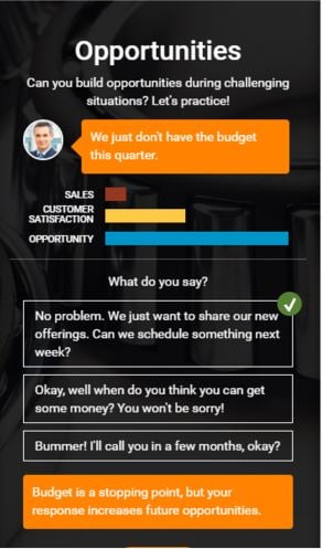
Video is just one example that can engage learners on the mobile platform. Pictured below is an  example that lets learners practice a sales conversation (like Bob from above) in a standalone micro-module designed specifically for the smartphone. Learners respond to a variety of challenging customer statements and gauge their performance against three metrics: sales, customer satisfaction, and opportunity. Of course, we could make different design choices, such as using audio in place of customer text, or showing five-second video clips of each customer interaction and asking learners to choose the best way to move the sale forward.
Mobile technology is here to stay, and the most advanced organizations are working to find the best ways to operationalize it for their employees. If you’re moving to mlearning, you’ll want to consider these design questions:
-
What is the most logical way to structure and sequence the content for the mobile environment?
-
How can we unpack a large task into smaller ones that learners can practice individually at the micro level?
-
How can we simplify the content and interactivity while maintaining fidelity?
-
Which elements help learners navigate intuitively without a lot of extra buttons to tap?
-
How can we assess learners to ensure they’re tracking as they work independently?
These are just a few thought starters, and they’ll hopefully help you begin to map out your design for your mobile learning projects.
Learn the value of true instructional interactivity & create Meaningful, Memorable, and Motivational e-Learning!
.png?width=135&height=135&name=Ann(250).png)
About the Author: Ann Iverson
Ann is an instructional designer for Allen Interactions who’s consulted for many years with a variety of clients, industries and projects. She learns best by making mistakes!
Comments
Would you like to leave a comment?
Related Blog Posts

By: Ann Iverson | Jul, 2014
Category: Custom Learning

Blog
Make a Learning Love Connection: Five FACTS for Better e-Learning Courses
By Ann Iverson, Senior Instructional Designer What was the last thing you learned on your phone? A new cooking technique? How to write better emails? ...
By: Ann Iverson | Feb, 2015
Category: Custom Learning

Blog
3 Instructional Design Strategies for SMART Change
By Ann Iverson, Senior Instructional Designer What was the last thing you learned on your phone? A new cooking technique? How to write better emails? ...
By: Ann Iverson | Nov, 2017
Category: Custom Learning

