Blog
Designing Learner Interfaces - Unity, Liberty & Charity
by Christopher Palm, media artist Hear that? It’s the faint sirens of the branding police speeding their way to this blog at this very moment. Quick! ...


Breaking the Branding Law and Getting Away With It
By Allen Interactions | March 28, 2013 | Custom Learning | 0 Comments
by Christopher Palm, media artist

Hear that? It’s the faint sirens of the branding police speeding their way to this blog at this very moment. Quick! We don’t have much time before they shackle us with their “branding guidelines” and force us to endure long recitations of the importance of their brand to the very existence of humanity.
Should we run? Maybe we can give them the slip once or twice, but before long they’ll release the hounds and drive us into submission.

Can we hide? It’s possible to have our creative design go unnoticed, but the brand police are still out there, making their rounds, and it is just a matter of time before they pick up our trail or find something suspiciously out of place in their world ruled by the Style Guide.
Maybe we should just turn ourselves in from the get go and do it their way. After all, it’s their world we’re designing in, right? That wouldn’t make for a very exciting blog, though, would it?
Don’t get me wrong, brand guidelines are a wonderful thing. They establish a company’s image and persona, and give it a consistent and familiar face by which to be recognized. But it is that familiarity that may preclude brand guidelines from being useful to learning. Actual learning happens when the learner is engaged and motivated, and media is vital to keeping the veil of immersion cast upon our audience for as long as possible.
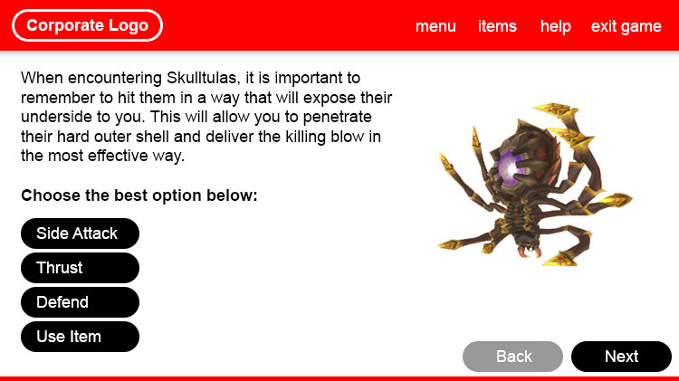
Which would you rather explore?
This encounter in the Legend of Zelda Skyward Sword styled to a [pretend] Nintendo® brand guideline

—Or—
The actual game where the style emerges organically based on the context and content

Granted, your e-learning project will probably not have nearly the same budget as a mainstream video game such as Nintendo’s Zelda franchise, but there are definitely similarities that can be drawn to how we should approach the visual design of our e-learning courses.
Go ahead and fire up your favorite video game of choice, just about any game will do (even mobile). The first thing you may see is a couple opening credits and logos. That is a pretty standard approach. But then something changes as you move into the game’s main menu. Suddenly, we see a screen that looks completely different from the company’s brand—a screen that is tailored to the content of the game it precedes.
Exactly!
Let’s go a little deeper. Press any key!
In Clash of Heroes, the menu screen vanishes and we’re now launched into the gaming environment. Around the edges of the screen we may see specific interface elements. These interface elements match the overall look of the content, creating a seamless and immersive environment in which one could easily lose six hours in the blink of an eye. There’s no company logo in the corner, not even a game title—and definitely no sterile corporate blue header across the top. There’s no reminder of who made the game while you’re in the game.
The video game industry has had this method locked down since its inception.  So, why do we always fall into the polar opposite when it comes to e-learning? What compels us to format our courses like a corporate website or print out? Such methods lead to a dull and disconnected learner experience. But, if you can let the inherent context and challenge of the content run the show, suddenly you’ll be on your way to building an immersive and engaging experience.
Being true to your content is your “get-out-of-branding-jail-free-card” and your media can live life in peace and not pieces.
Christopher Palm is a Media Artist at Allen Interactions with over six years experience in the e-learning industry. As a Media Artist, Christopher is responsible for creating intuitive and well-designed interfaces, interactions, and graphics that lead to an immersive and engaging learning environment.
.png?width=135&height=135&name=ai-symbol-green%20(3).png)
About the Author: Allen Interactions
Comments
Would you like to leave a comment?
Related Blog Posts

By: Allen Interactions | Mar, 2010
Category: Custom Learning

Blog
Overcoming One Size Fits All Learning
by Christopher Palm, media artist Hear that? It’s the faint sirens of the branding police speeding their way to this blog at this very moment. Quick! ...
By: Allen Interactions | Nov, 2014
Category: Custom Learning
.jpg?width=316&name=lee_steve_(2).jpg)
Blog
Games vs. Gaming: Creating Custom e-Learning
by Christopher Palm, media artist Hear that? It’s the faint sirens of the branding police speeding their way to this blog at this very moment. Quick! ...
By: Allen Interactions | May, 2009
Category: Custom Learning

