Blog
Generous e-Learning Design
by Linda Rening, instructional strategist My Great Aunt Belle was a wonderful cook. She spent days in her prairie farmhouse in Southwestern Minnesota ...


Generous e-Learning Design, Part 2
By Linda Rening | July 31, 2014 | Custom Learning | 0 Comments
by Linda Rening, instructional strategist
.png?width=120&height=120&name=linda(250).png)
My Great Aunt Belle was a wonderful cook. She spent days in her prairie farmhouse in Southwestern Minnesota getting food ready for any family gathering, and the family spent weeks looking forward to her delicious meals.
The challenge came with Belle’s belief: “If a little is good, a lot is better.”
She was used to feeding farm hands during busy harvest times, so when it came to the family, she prepared huge amounts of food despite the fact that many of our family members didn’t know a threshing machine from a combine. She also got her feelings hurt if anyone said “no” to a second or third helping of anything she had prepared.
Force Feeding Content
Was Great Aunt Belle generous? Of course. Was that generosity always the best thing for her guests? Not Really.
You’ve likely already made the connection to e-learning. Force feeding content to our learners is not being generous because it doesn't take into account what’s in the learner’s best interest. Whether it’s an overabundance of food or a flood of information, gluttony is neither pretty nor pleasant.
What, then, is generous e-learning? Brenda Griffith, who is also an Instructional Designer at Allen Interactions, made this comment to my original blog on generous e-learning:
…being generous is about doing more than is strictly necessary or expected. Instructional designers add value by not regurgitating content from a SME [Subject Matter Expert], but by translating it, simplifying it or re-focusing it for the learner. The content/quiz format is an example of taking the path of least resistance.
I agree. When we dump content on our learners and then write recall-style test questions, we are really taking the lazy way out.
A Two-Step Approach to Avoiding the Gluttony
So, let’s get practical. How can we go about “translating, simplifying, and re-focusing” content for our learners, as Brenda suggested?
The first step is to answer the most important question: What will learners DO as a result of this e-learning course? We then dig out our Bloom’s Taxonomy and write good behavioral objectives.
Once we have our behavioral objectives, we can ask the next important question: What do learners need to know to be able to perform the desired behaviors correctly? From those answers, we should be able to identify important content and information.
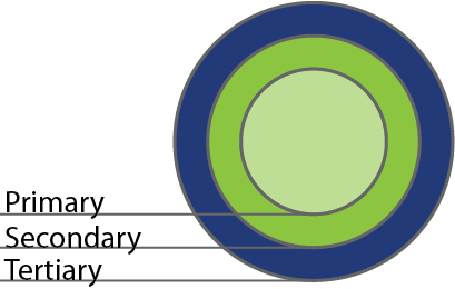
Then comes the step that is often overlooked: organizing the information in such a way that we aren’t just dumping content on our learners, but rather simplifying it for better understanding. One way to do that is through what I call the Hierarchy of Information, which looks like this:

Using this model, we think about all of the information that we could relate to learners and we decide what’s crucial to performance, then what’s directly related to the crucial information, and finally what is tangential, but still pertinent. Those become the primary, secondary, and tertiary sets of information. In other words:
- Primary: must know
- Secondary: nice to know
- Tertiary: could know
As we begin the process of moving information to an e-learning course, it is only the primary information that is actually in the e-learning course. The secondary is included as optional pop-ups or behind another kind of optional click, and the tertiary is accessible via hyperlinks or resource documents. Instead of giving the learner the information, we give the learner the choice about getting the information: “Click here to read more about…”
An Example
Here's an example: Let’s say we were going to create an e-learning course on good instructional design. We could organize our content like this:
- Primary
- CCAF (Context, Challenge, Activity, Feedback)
- 3 M’s (Meaningful, Memorable, Motivational)
- SAM (Successive Approximations Method)
- Secondary
- On-line examples of Context, Challenge, Activity, Feedback
- Theories of motivation as related to learning
- Ways SAM is more effective than ADDIE
- Tertiary
- History of instructional design
- e-Learning development tools
- How to augment e-learning with media
Second Helpings are Optional
Is that the only way to organize content on Instructional Design? Of course not. The specific organization would depend on our behavioral objectives for our learners, the relative expertise of learners coming into the course, etc.
Organizing and prioritizing content for our learners is not taking the easy way out by just dumping content into PowerPoint slides. It means we are putting our learners first and deciding how we can help them get the knowledge and skills they need to be successful.

Information is like my Aunt Belle’s peach pie: the first piece is a great way to end a wonderful meal; the second and third pieces should be optional.
Want to share this post? Here are some ready made tweets:
Click to Tweet: IDs add value by translating, simplifying or re-focusing content for the learner. http://hubs.ly/y02_lh0 @customelearning #generouselearning
Click to Tweet: More content ≠ Generous e-Learning | Learn how to create generous #elearning http://hubs.ly/y02_lh0 @customelearning #elearningtips
Click to Tweet: A Two-Step Approach to Avoiding #eLearningContent Gluttony http://hubs.ly/y02_lh0 @customelearning #elearningtips
.png?width=135&height=135&name=linda(250).png)
About the Author: Linda Rening
Comments
Would you like to leave a comment?
Related Blog Posts

By: Linda Rening | Apr, 2014
Category: Custom Learning

Blog
Incredibly Obvious e-Learning Design
by Linda Rening, instructional strategist My Great Aunt Belle was a wonderful cook. She spent days in her prairie farmhouse in Southwestern Minnesota ...
By: Linda Rening | Nov, 2014
Category: Custom Learning

Blog
e-Learning Design Challenge: Dump Next or Stump Linda
by Linda Rening, instructional strategist My Great Aunt Belle was a wonderful cook. She spent days in her prairie farmhouse in Southwestern Minnesota ...
By: Linda Rening | Feb, 2015
Category: Custom Learning


