.png?width=135&height=135&name=Michelle(250).png)
Blog
Six Principles for Assuring Quality in e-Learning
By Michelle Kenoyer, Quality Assurance Specialist What makes e-learning quality assurance (QA) different from standard-issue software or website QA? ...


By Michelle Kenoyer, Quality Assurance Specialist
.png?width=125&name=Michelle(250).png)
What makes e-learning quality assurance (QA) different from standard-issue software or website QA? It’s more than just clicking buttons, proofreading text, testing for load and performance, making sure everything works across browsers, usability/user experience, and so on.
All of these issues are very important, of course, but QAing for e-learning goes a little deeper. As I stress in an earlier blog post, it is important to consider the learner experience as well as the user experience, and to also evaluate courseware from the intended learning audience’s perspective.
Put yourself in the shoes of the courseware’s intended audience. How are learners going to engage in the courseware? Is completing the material going to be a pleasant, motivating experience for them, or is it going to be another e-learning requirement that gets back-burnered or skipped through, and then quickly forgotten?
Whenever you sit down to review a course for QA, think of the learner. Analyze the courseware from a learnability standpoint and be an advocate for your courseware’s learners. It can’t be repeated enough: when QAing for e-learning, always think of the learner.
Here are 8 examples of what to look for, from a learner’s standpoint, when you’re QAing a course. These examples are all from hypothetical courses that mirror real-life issues often uncovered during courseware QA.
1. The Wall of Text Phenomenon
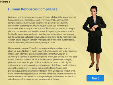 Take a look at Figure 1. Your eyes probably glazed over before they even reached the greeked Lorem Ipsum text, didn’t they? The sheer density of the content, as well as the text-to-graphics-to-white space ratio, is enough to turn off even the most attentive of readers in an e-learning course before they start reading the first line.
In your role as a QA reviewer, recommend to developers and instructional designers that this page be treated in a way that better engages the learner. At a bare minimum, particularly as a stop-gap measure under a deadline crunch, recommending that the designer break up this page into several pages with more concise, easily digestible content would be acceptable.
2. Missing or Vague Interaction Instructions
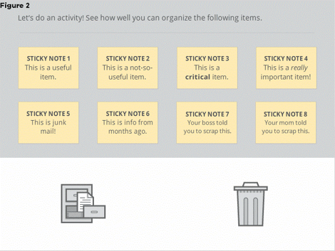 What’s the learner supposed to do in Figure 2? A curious learner who’s seasoned in online training might be able to figure out that he or she needs to click one of the people images to start a scenario, but a learner who is newer to online training might be lost on what to do. Also, the filing cabinet and trash can aren’t appropriately captioned, so it’s not completely clear how learners are supposed to treat them.
A proactive QA reviewer would do well in recommending some instructional text to fill the void (and in doing so, assist the instructional writer). In Figure 2, suitable instructions might read: Drag and drop each item to the file cabinet (required items) or to the trash can (optional stuff).
3. Incorrect Interaction Instructions
This should be a no-brainer, but it also lends to lack of instructional clarity and confusion for the learner if you’re giving him or her instructions to do one thing, but the interaction does something totally different. This is almost worse than not giving the learner instructions at all. Nothing’s more frustrating to have to figure out how to perform an interaction in a certain when specifically instructed to do it otherwise.
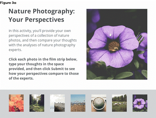
Note that, in Figure 3a, learners are instructed to click a photo in the film strip below, type their thoughts in the space provided, and then click Submit to see how their perspectives compare to those of the experts. Sounds good, right?

In Figure 3b, learners do indeed click the image and see the photographer’s perspective on it (prematurely). However, where’s the text field? Where’s the Submit button? Also, the learners weren’t supposed to see the expert photographer’s perspective until typing in and submitting their own.
4. Feedback with No Context
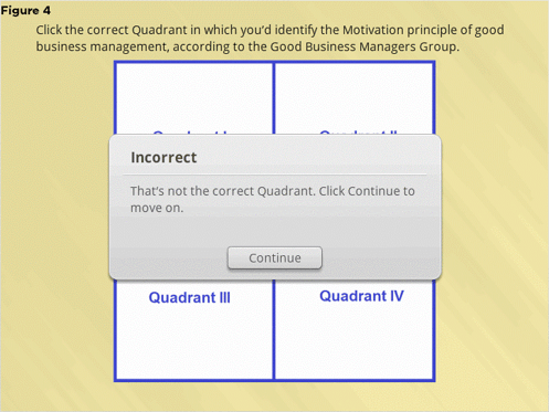 Why is the selected Quadrant in Figure 4 above incorrect? Why doesn’t it represent the Motivation principle of good business management, according to the authorities of the Good Business Managers group? How might the learner identify the correct Quadrant the next time around? In this case, it’s crucial to give succinct feedback as to where the learner could’ve taken a different approach, especially if the interaction doesn’t have Try Again functionality, as in Figure 4’s example.
5. Missing Resources
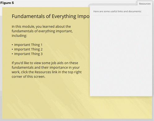
This is especially an issue when you’re referring learners to the non-existent resources specifically in the e-learning content, as in the instance shown in Figure 5 (“click the Resources link in the top right corner of this screen”). It’s understandable that all of the completed and most current Resources may not be available till Alpha or even Beta, but by Gold release, resources should definitely be in place so they aren’t overlooked and unavailable to learners who are desperately wondering where they are.
6. Inefficient Interaction Navigation
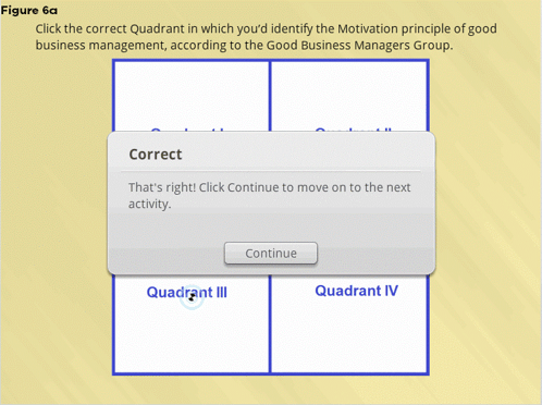
Figures 6a and 6b demonstrate an example of clicking Continue to close a feedback box, and then returning to the same activity page and having to click Continue a second time to move on. This is inefficient for learners and wastes their time, particularly if they have to complete a multitude of these types of activities throughout the e-learning.
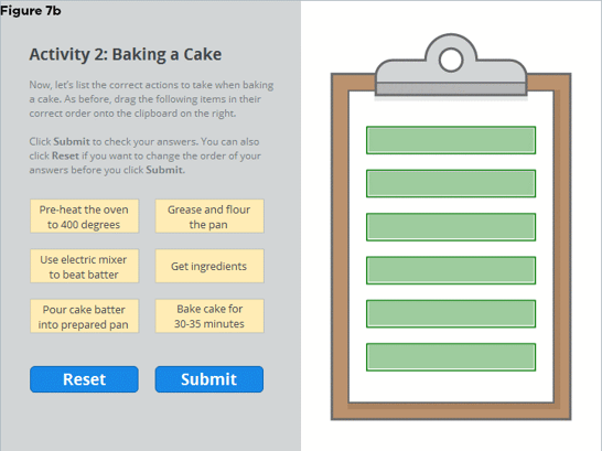
7. Inconsistent UI Elements and Conventions
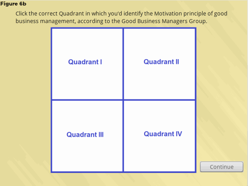
This is where usability and user experience come into play. Do you notice that, in Figure 7a, the Submit button is on the left side and the Reset button is on the right?
In Figure 7b, a continuation of 7a’s activity, note that these buttons’ positions are reversed. After you’ve initially set a learner convention in an activity type, stick with that convention—stay consistent. Learners will be counting on you to know what to expect when completing subsequent activities following the first one that sets the gold standard.
8. Dead-Giveaway Activity Options or Quiz Questions
These questions are ones in which “All of the above” is always the right answer, “Both A & B” is correct, overuse of “None of the above”, or the longest answer is consistently the correct answer.
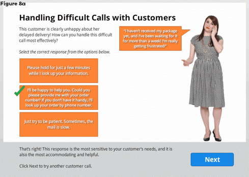 Figure 8a demonstrates an example of the longest answer being the correct one. On some occasions, this is unavoidable, but it shouldn’t be a habit. Over-reliance on this habit diminishes the activity challenge, and with it, learnability.
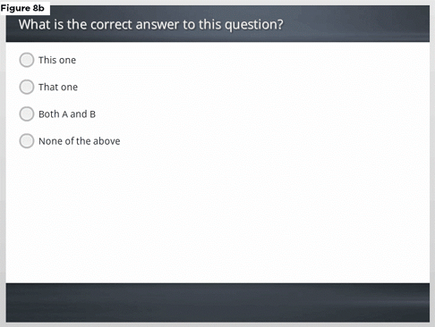 Figure 8b demonstrates a double-whammy instance of a “Both A & B” option along with a “None of the above” option in a quiz question. The pool of viable options is decreased, with “None of the above” being a frequently ignored distractor and “Both A & B” calling too much attention to itself as the right option. Again, a dependence on these options in the name of expedience reduces challenge and learnability.
Instructional designers and writers need to avoid relying on these stock easy-out answers as an alternative to writing thoughtful, challenging assessment questions—and QA reviewers should be vigilant in calling attention to these habits.
By now, you should have an idea of just some of the learnability issues to look for when you’re reviewing a course during QA. Remember that QAing an e-learning course means much more than making sure the course functions well and has no misspellings or egregious layout issues (though these elements are doubtless important). QAing a course through the eyes of learners must ensure that no obstacles fall in the way of a solid learning experience—and that the learners are uninhibited in reaching their performance goals.
When you’re QAing an e-learning course, put the learner first. Always think of the learner.
LIKE WHAT YOU'VE READ? CLICK THIS READ-MADE TWEET TO SHARE THE KNOWLEDGE!
CLICK TO TWEET: Eight #eLearning Issues to Avoid During #QA http://hubs.ly/H01m5Bv0 #aiblog by @michellekenoyer

Comments
Would you like to leave a comment?
Related Blog Posts


Blog
What's So Bad About Boring e-Learning?
By Michelle Kenoyer, Quality Assurance Specialist What makes e-learning quality assurance (QA) different from standard-issue software or website QA? ...

Blog
Go Beyond Busy Work: e-Learning Design with ACTION
By Michelle Kenoyer, Quality Assurance Specialist What makes e-learning quality assurance (QA) different from standard-issue software or website QA? ...