Blog
Pillar IV for Transformative e-Learning Instructional Design: Feedback
by Ethan Edwards, chief instructional strategist | @ethanaedwards


Instructional Design: Make the Switch to Interactive e-Learning
By Ethan Edwards | July 12, 2013 | Custom Learning | 0 Comments
by Ethan Edwards, chief instructional strategist | @ethanaedwards
 I’ve taught the ASTD e-Learning Instructional Design Certificate Program for a number of years now. One of the greatest takeaways for the participants, I have found, is how empowering it can be to realize the significant impact each of us can have as designers when we take on the central instructional design challenge: creating an environment and an experience in which the learner will gain some knowledge or skill more effectively and efficiently than he or she could without the instruction. That’s my common-sense definition of what instructional design is.
Unfortunately, many organizations completely overlook that aspect of designing instruction—especially when the instruction is intended for online delivery. I find that in many cases instructional design has been downgraded to simply word processing and formatting as existing documents or presentations are transferred to a web-compatible format. Or, that enriched media e-learning is little more than an elaborate decoration that doesn’t change the experience in any central way. That interactivity rarely rises above the useless task of repetition of presented information.
Design is transformative. Design has to tear the content apart and restructure it with the learner AND the capabilities of the delivery mechanism in mind. Design can’t be a cookbook solution. Different content domains will require different instructional approaches. Different delivery environments will create unique challenges and opportunities for the learner to interact with the content and challenges at hand.
In this article, I just want to hint at how transformative an open approach to instructional design can be in your own work. As a baseline, I’m proposing a bit of content that is not, strictly speaking, a piece of e-learning, but it is certainly intended as instructional writing and is delivered via the web. It is rather a great website in its clear presentation of content. Indeed, even without interactivity, I think it is actually a lot better than many more formal e-learning lessons. Take a quick look at it here. As you can tell with a quick glance, it’s a short “page turner” about how a three-way light switch works. Did you read it? Did it make sense? Do you think you really learned anything? Even with that relatively clear and concise presentation, I bet that very few of us learned much from it. Whatever design was involved was focused entirely on the content and not at all on the learner.
What happens when you start designing for the learner? Well, you immediately end up thinking about what the learner is doing instead of what you are telling them. Compare what you learned from the first version we just looked at and this interaction, built in ZebraZapps:
Suddenly the heart of the instruction is all about what the learner is doing and not what the “teacher” (the internet) is presenting. Creating these interactions must be at the center of the instructional designer’s activity. The content writing is necessary but secondary to the interaction.
This example is by no means ideal, but I wanted to show how even the simplest approach to creating an experience for the learner changes the whole foundation of the learning event. The instructional designer should refine and extend the interactivity to introduce a sense of challenge and purpose as suggested by this revision:
Of course, there are details that would need to be worked out—better feedback for incorrect attempts, more complete reference resources to explain the content if necessary, etc.—but the value of the lesson has just been magnified several times over as a result of the instructional designer’s craft.
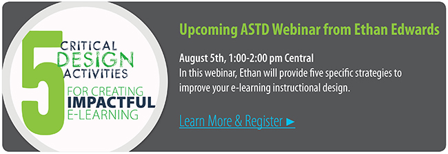
I challenge you instructional designers out there to embrace the possibility of transforming you learners through your dedication to creating learning experiences. If you are interested in enhancing your own design process, consider joining me for a webinar “5 Critical Design Activities for Creating Impactful e-Learning” on August 5th.

About the Author: Ethan Edwards
Ethan Edwards draws from more than 30 years of industry experience as an elearning instructional designer and developer. He is responsible for the delivery of the internal and external training and communications that reflect Allen Interactions’ unique perspective on creating Meaningful, Memorable, and Motivational learning solutions backed by the best instructional design and latest technologies.
Comments
Would you like to leave a comment?
Related Blog Posts

By: Ethan Edwards | Mar, 2021
Category: Custom Learning

Blog
Can We Avoid Hostile Instructional Design?
by Ethan Edwards, chief instructional strategist | @ethanaedwards
By: Ethan Edwards | Mar, 2022
Category: Custom Learning

Blog
How to Blossom as an Instructional Designer
by Ethan Edwards, chief instructional strategist | @ethanaedwards
By: Ethan Edwards | May, 2014
Category: Custom Learning


